The Three List Problem
Within medication management legacy system, users had to navigate three separate lists for medications and supplies – enterprise item list, site item list, and cabinet item lists. While it might seem that these should be subsets of the main list, they were not. Each item had different attributes based on its location and hence needed to be displayed separately. Although each item has a standard set of attributes giving it a unique Item ID, additional attributes dictated its behavior in various circumstances and locations. This resulted in differing attributes for the same item based on where it was stocked.
For example, an item might require a witness for dispensing at the enterprise level, but this requirement might not apply at a specific site like the ER (site/cabinet) for operational efficiency. SO the attribute that defined witness required for dispensing would be marked ‘Yes’ unless the item is located within ER. SO the same item would be repeated multiple times within each list, so users can view its unique attributes based on where it was stocked. Users had to navigate through enterprise, site, and cabinet lists to understand how an item behaves in different locations.
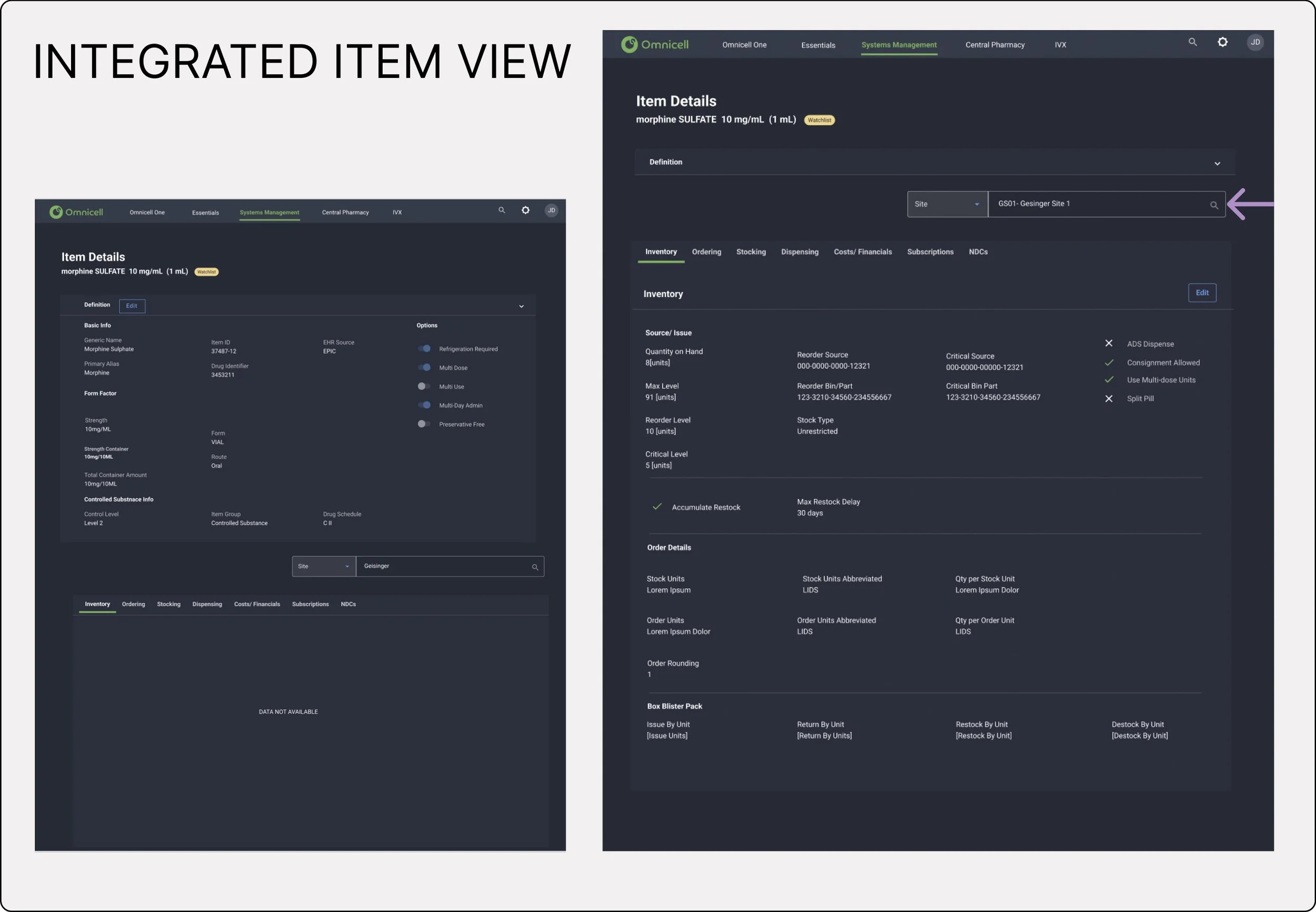
Here, you can see the screen displays ‘Item Details’ view, where users can access the standardized item attributes that define the item. The second screen illustrates what happens when the item definition is collapsed, allowing users to access the enterprise standard attributes (for item behavior). Users can then choose a faceted search to get to a specific site or cabinet and observe how the item attributes differ based on location. For instance within the Dispensing Tab - Witness Required would say ‘Yes’ as a default for enterprise level, but if the user navigated to a site ‘Emergency’, the same attribute would now show as ‘No’ to reduce friction during medication dispensing.
Every study conducted, found this multiplicity of lists confusing for the users, and I observed pharmacy staff often becoming perplexed when checking item details. I struggled to initially find a solution for a unified list since each attribute could have a different value based on the location of the item.
I have to admit, I love when I find a simple solution, that seem invisible and intuitive. At times, the most effective design solutions are imperceptible. I added a location selector within the item attributes view. This approach helps users to seamlessly navigate between item attributes based on the location.